Jeni’s Ice Cream Stores in Chicago is a spot I love visiting. With its endlessly rotating menu of creative flavors, it’s a perfect storm of delight and decision fatigue. Every time I go, picking a single scoop feels less like a treat and more like a test.
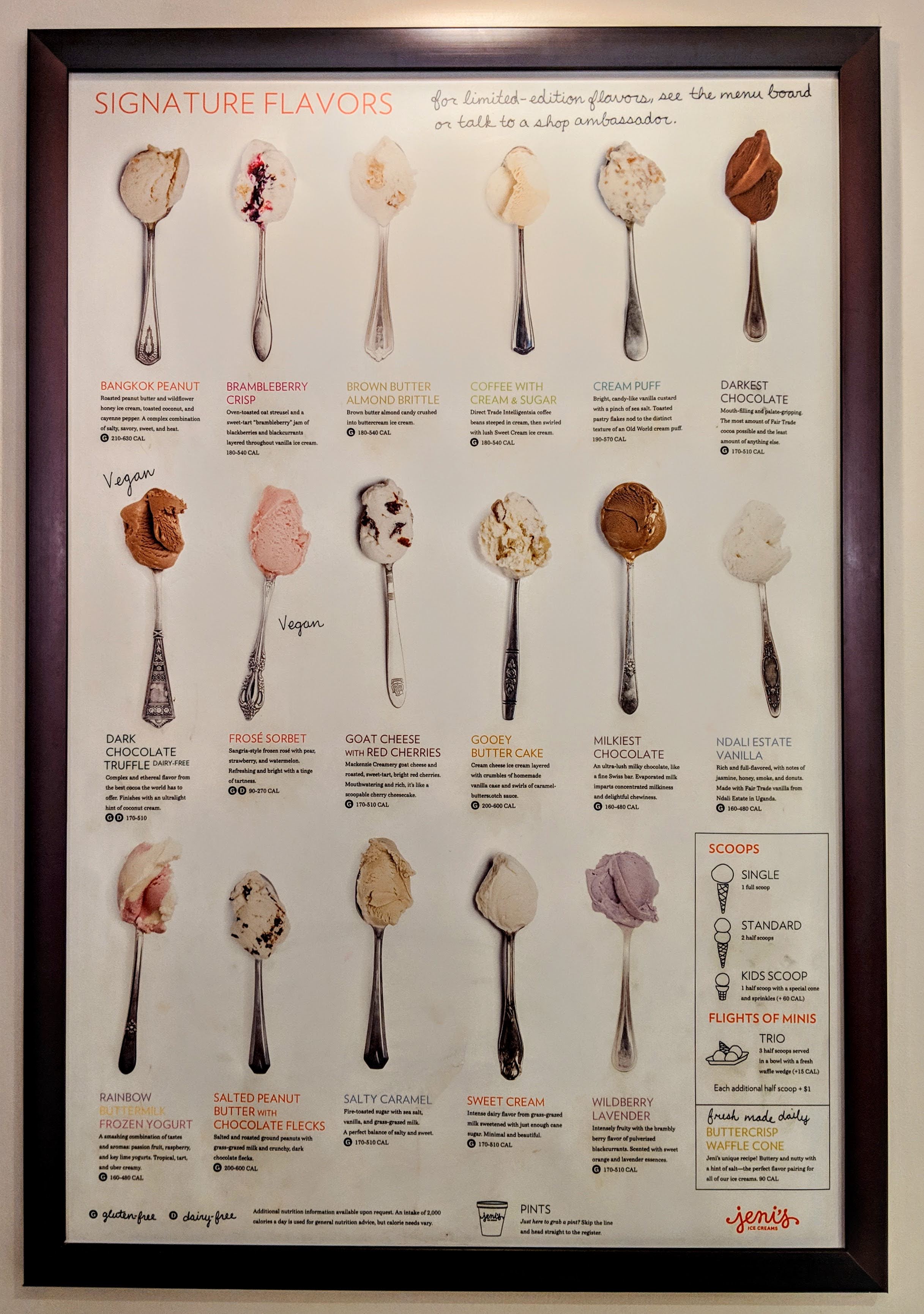
So try this: your friend is at the counter ordering a flight of six scoops and needs your ranked list in 30 seconds.
Once you have that list, let’s put it to the test:
- Would you trade one scoop of #1 for two scoops of #3?
- Is #4 almost as tempting as #3, or clearly a step down?
- What would make you bump #6 from kid-size to full?
That mental friction, often called choice overload, does more than slow you down. When options flood working memory, we simplify, settle, or even randomize. The answer that leaves our lips may no longer match what we actually prefer.
Think about the post-booking surveys from car-rental firms, hotels, even your local restaurant: ten sliders on price, efficiency, friendliness, everything. Be honest: did those scores truly match your priorities, or did you just click through to make the prompt disappear?
Here’s the problem: if your answers are going to drive real decisions, and if decision-makers want to allocate resources based on what people actually care about, we need survey tools that do more than collect surface impressions. We need tools that make trade-offs visible. Instead of penalizing hesitation, we need survey tools that respect how people make trade-offs and navigate uncertainty. That’s exactly what the rest of this post explores: a lightweight scaffold that lets respondents think first, commit second.
Recap: Quadratic Surveys
Quadratic Surveys (QS) are a surveying method that captures not only which options participants prefer, but also how strongly they feel about them. Each participant starts with a fixed credit budget. QS presents participants with a list of options and lets people cast positive or negative votes. The cost of each vote rises quadratically: 1 vote costs 1 credit, 2 votes cost 4 credits, 3 votes cost 9 credits, and so on. This escalating cost structure forces trade-offs, encouraging participants to spend more only on what matters and hold back on what doesn’t.
QS responses align with true priorities
In our previous research, we found that when participants used Quadratic Surveys (QS) to express preferences across societal issues, their votes more closely matched their actual donation behaviors compared to traditional methods like Likert scales. This alignment indicates that QS captures preferences that are more consistent with participants’ real-world actions.
QS is expressive but cognitively demanding
This level of expressiveness comes with a cognitive cost. When the list of options is long or the budget is high, respondents engage in mental accounting, the internal ledger we keep when juggling credits. They may ask, “If I give option A 3 votes, should I give option B 5 votes to reflect my choice between them?” or “Am I overcommitting to this one?” Because most of us construct our preferences on the fly (think of choosing ice cream flavors), this internal bookkeeping can lead to cognitive overload, guesswork, or satisficing. Ironically, this burden can bring back the very problems that QS is meant to avoid.
Organize, Then Vote: A Scaffold for Preference Construction
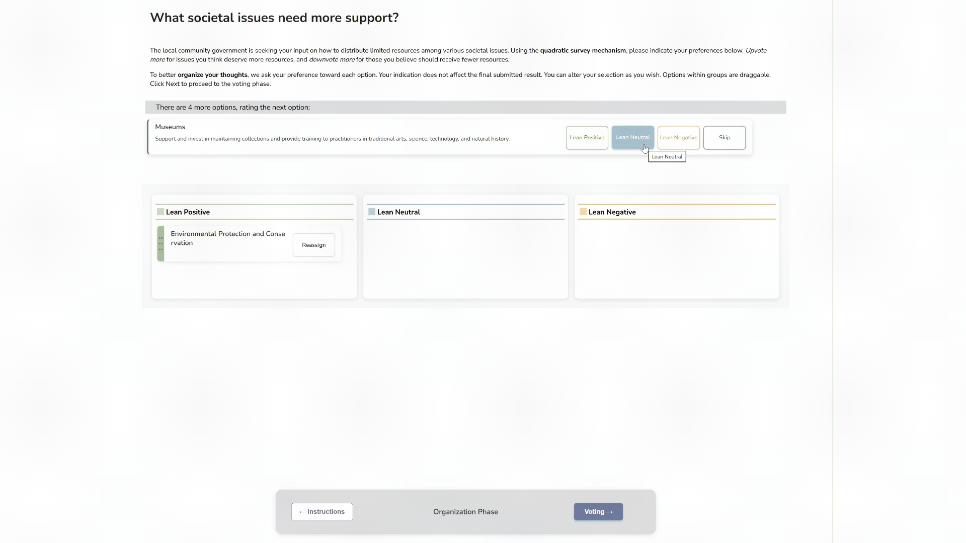
Based on decades of research in studying how people construct their preference and how one responds to questionnaires, instead of asking people to jump straight into voting, we tried something else: a two-phase survey design that aligns with how people naturally organize thoughts.
Organize Phase – Users quickly sort each option into one of four soft categories: Lean Positive, Neutral, Lean Negative, or Skip. It’s a fast, low-pressure pass, not a commitment.
Voting Phase – With options now grouped, users assign votes using the QS mechanism to express preferences and reveal trade-offs.
This design isn’t just a shinier UI. We call the approach “Organize-Then-Vote.” It doesn’t simplify the decision itself, but it helps people structure the process. By allowing them to clear mental space before committing, it lets them focus on what matters most.
Our lab study put this to the test.
What We Found
We ran a controlled study with 40 participants, split evenly between two interfaces: the two-phase Organize-Then-Vote design and a standard single-page version. Half of the participants saw 6 options; the other half saw 24. Everyone started with the same credit budget that could be allocated across public priorities such as education, healthcare, and the environment.
We measured three things:
- NASA-TLX scores: It is a standard questionnaire used to measure the cognitive load after a person completed a given task.
- Clickstream logs: Detail record of every edit, navigation, and interaction with the interface.
- Semi-structured interview: post task reflection and explain where participants felt the cognitive challenges lie.
Here’s some key takeaways:
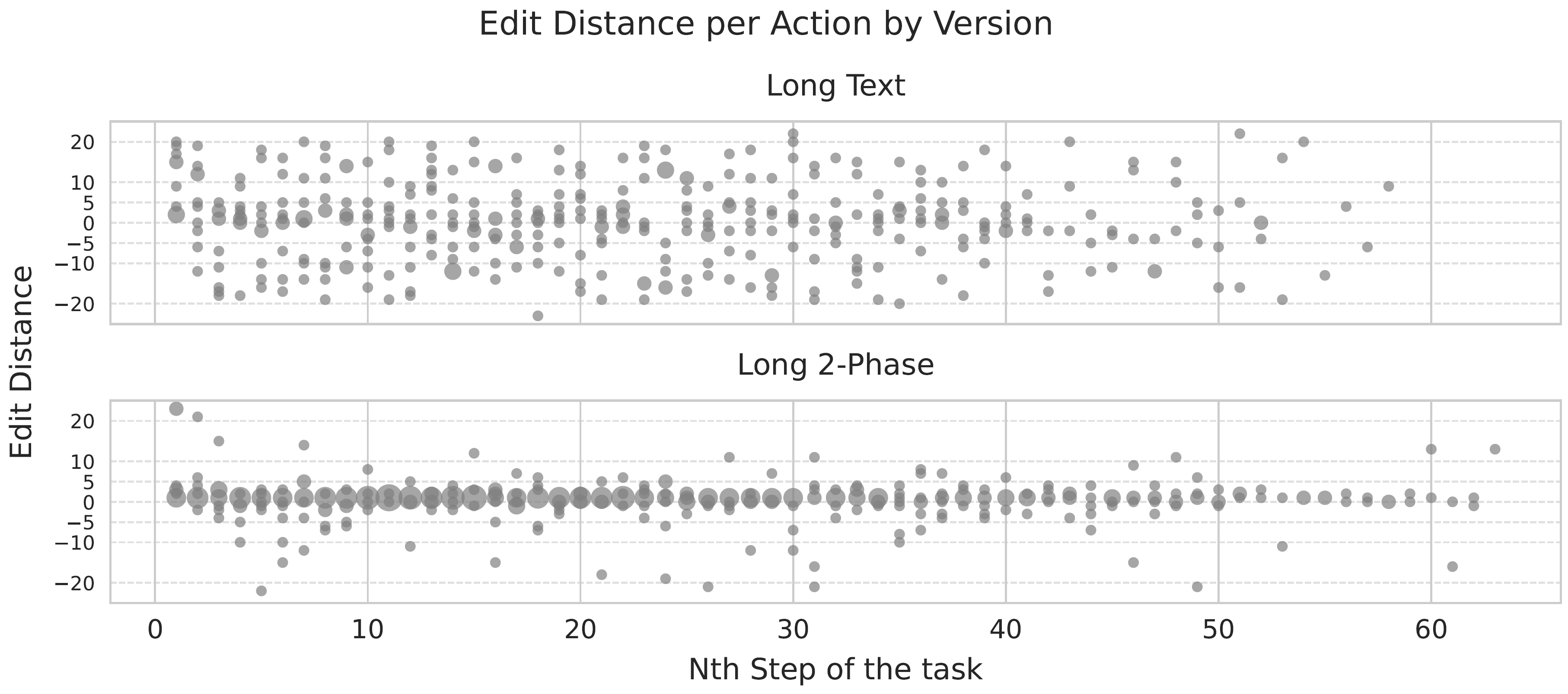
More engagement, better reflection:
In the two‑phase interface participants spent more time per option and, crucially, they moved between neighbouring options rather than jumping around the list. Click-stream data showed a smaller traversal distance (the number of options between the current edit and the previous one), signalling deliberate local comparisons.
In other words, the organizing phase allowed participants to follow a more structured decision strategy. Qualitative coding confirmed that participants, especially on the 24-option survey, channelled effort into strategic thinking: weighing priorities, reflecting on trade-offs, and considering consequences.
"With so many different issues… how do I personally prioritize them? And to what extent?"
—Participant S009 (Two-Phase survey with 24 options)
Less satisficing:
Satisficing is a decision strategy in which a person accepts an option that is “good enough” rather than searching for the best possible one. It often shows up as: skipping fine-tuning, applying a simple rule of thumb without further thought, or stopping the search the moment an acceptable answer appears.
In our study, satisficing behaviour appeared far less often in the two-phase condition, especially on the twenty-four-option survey. Low-effort edits and random jumps were rare. By contrast, participants in the single-page interface devoted most of their energy to mechanical actions such as nudging values, re-reading items, and doing mental arithmetic to spread the budget. That operational effort came at the cost of preference construction.
"Trying to figure out what upvotes I should give […] went back and forth between those two. […] it was very mentally tasking for me."
—Participant S015 (Long Survey, Text Interface)
In short, the two-phase design replaced mechanical busywork with deliberate reflection, reducing satisficing and encouraging participants to refine rather than settle.
Greater satisfaction: Finally, participants using the two phase interface reported higher confidence in their responses. Post-task interviews highlighted that two-phase users felt they had a “chance to think things through” and that the grouping step helped them understand their own values before allocating votes.
In summary, participants using the two-phase design spent more time, made more local edits, and reported higher cognitive load on the twenty-four-option survey, but not because they were stuck. They were actively comparing options of similar priority and refining their answers. When effort shifted from mechanical operations to strategic reflection, the resulting data better captured genuine preferences. These behaviors are exactly what any research or survey designer wants.
Takeaway: Design Shapes Preferences
This study is not just about preferences for ice cream flavors. It illustrates how interface design can meaningfully shape the quality of decisions in high-stakes contexts: public budgeting, community feedback, or organizational strategy.
For practitioners and researchers using surveys to inform action: whether you are prioritizing infrastructure investments, setting internal policies, or evaluating service trade-offs, designs like the two-phase Quadratic Survey interface help surface more grounded, deliberate preferences.
For CX and UX designers, this work echoes the core principle: interface design is cognitive design. Structured and phased processes facilitate deeper engagement and reduce the likelihood of shallow or reactive responses.
And for all of us: sometimes what feels like indecision is actually a reflection of complexity. Giving people the right tools doesn’t just capture preferences. It helps them form them more intentionally.
Why not dive deeper?
If you’d like to experience the two-phase Quadratic Survey first hand, visit qsurvey.online. For a deeper dive, our paper, our analysis notebooks and video presentation explore the technical and empirical foundations of the study. If you’re interested in adapting this approach for your community or organization, please reach out as we love collaboration!
Back to Jeni’s.
Next time you’re at Jeni’s, try organizing your top picks before you get to the counter. You might just surprise yourself. Maybe what you wanted after all was a full scoop of Brown Butter Almond Brittle instead of your usual safe-choice vanilla kid’s scoop.

Resources
@inproceedings{cheng2025organize,
author = {Cheng, Ti-Chung and Zhang, Yutong and Chou, Yi-Hung and Koshy, Vinay and Li, Tiffany Wenting and Karahalios, Karrie and Sundaram, Hari},
title = {Organize, Then Vote: Exploring Cognitive Load in Quadratic Survey Interfaces},
year = {2025},
isbn = {9798400713941},
publisher = {Association for Computing Machinery},
address = {New York, NY, USA},
url = {https://doi.org/10.1145/3706598.3714193},
doi = {10.1145/3706598.3714193},
booktitle = {Proceedings of the 2025 CHI Conference on Human Factors in Computing Systems},
articleno = {475},
numpages = {35},
keywords = {Quadratic Survey; Preference Construction; Survey Response Format; Interactive User Interface; Cognitive Load},
series = {CHI '25}
}